Spruce | Fees + Escrow Project
Redesigning the company’s fee and escrow pages.
The company’s fee and escrow pages were Not Great™️. I had a responsibility to not only improve the user experience and interface, but also add in a bunch of new features.
Reimagining and combining the fee and escrow pages of Pinecone, the company’s internal tool, was a complex project designed to help Spruce employees work more efficiently, support sustainable growth, and prevent issues like audits and accounting errors.
As the lead designer, my role was to merge two separate pages into a unified experience. I focused on removing redundant elements, like having to input the same information across multiple pages, and adding user-requested features, such as easier fund disbursement and more visible calculations. Working closely with our UX researcher, I was able to better understand the financial lifecycle of our orders and ensure the final designs met user needs.
Throughout the project, I collaborated with our UX researcher and two product managers, conducting user interviews across multiple teams to gather feedback and refine designs. Once the designs were finalized, I handed off milestones to the engineering and QA teams, walking them through the designs and functionality in detailed sessions. To make the transition smoother for both users and engineers, we broke the project into two milestones (M1 and M2), making the overhaul more manageable and the new workflows easier to adopt.
tldr: I was the product designer for a massive overhaul of our fees and escrow pages. The work was broken into two deliverable milestones - M1 and M2.
The current workflows did more harm than good.
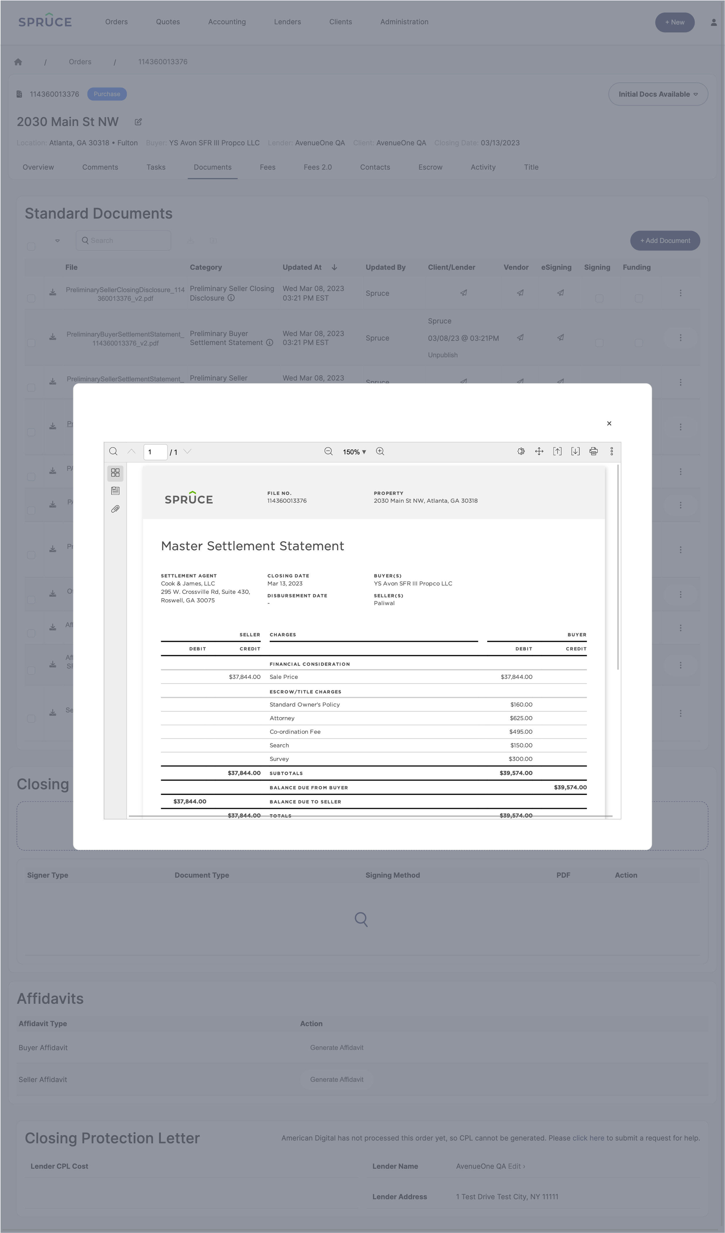
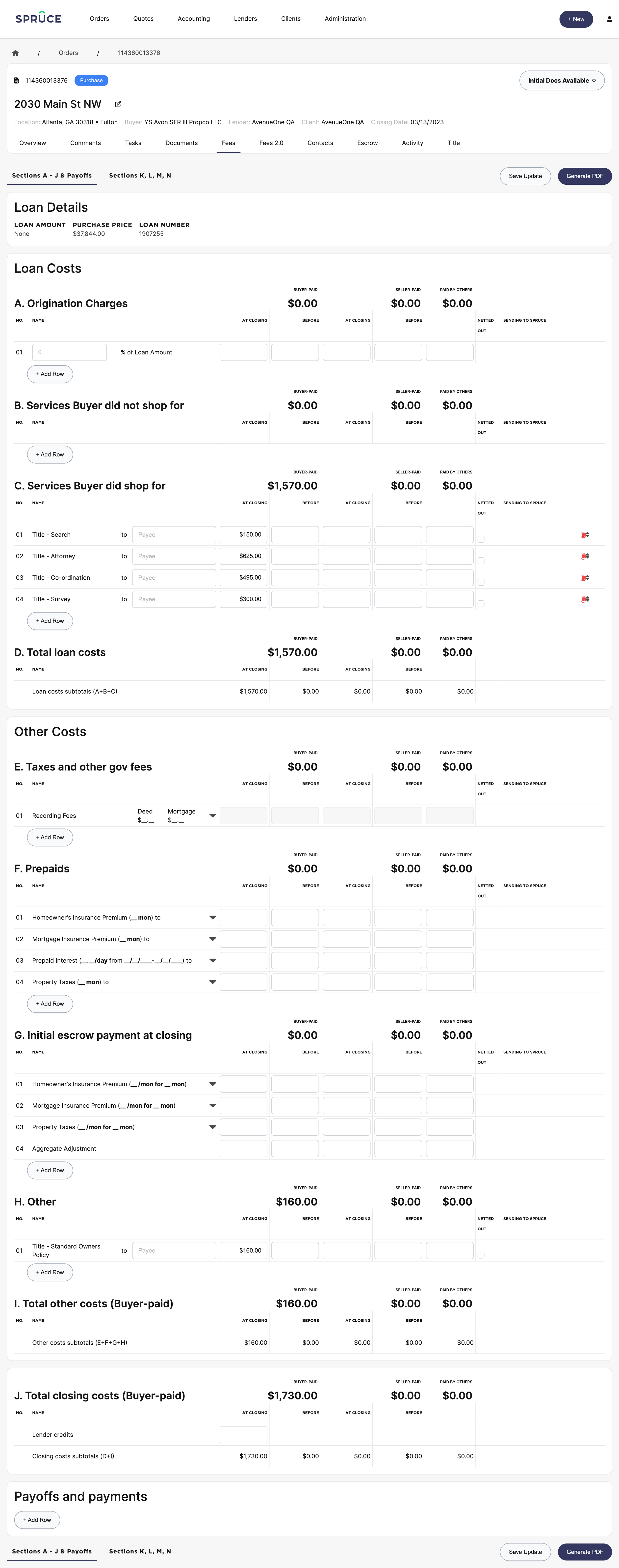
The fundamental issue driving this work to the top of our roadmap was the lack of intelligent communication between key sections of Pinecone, the internal tool used by Spruce. Specifically, the fees, escrow, and documents pages operated in silos, forcing users to piece together information manually to complete tasks accurately and protect Spruce from any inaccuracies.
This disjointed experience led to a reliance on inefficient workarounds. Users resorted to pen-and-paper calculations, printing multiple documents, keeping dozens of tabs open for cross-referencing receipts and payoffs, sending disbursements one by one, and checking recording fees through external services. These manual processes not only slowed down workflows but also introduced a higher risk of errors.
Through interviews with users across different teams, we identified their specific pain points:
Closers: Faced a highly manual process to retrieve fee amounts, either by downloading documents, searching through them, or relying on third-party services. They then had to input these fees manually into Pinecone.
Pre-Funders: Struggled with duplicative work, entering fees both in the fees tab and the escrow tab since disbursements could only be processed from the latter. The escrow tab itself was confusing and time-consuming to use.
Funders: In addition to double-checking fees entered by previous teams, funders had to disburse each line item manually and print checks one by one. Worse, they had to refresh the page between disbursements, significantly slowing down their workflow.
These inefficiencies led to delays, revenue loss, strained client relationships, and a deeply stressed team. Addressing these pain points was critical to improving operational efficiency and ensuring Spruce’s long-term success.
Please note: I’m unable to share screenshots of the escrow tab prior to the redesign due to sensitive information. Sorry!
Here’s what I’m thinking:
New Look and Features
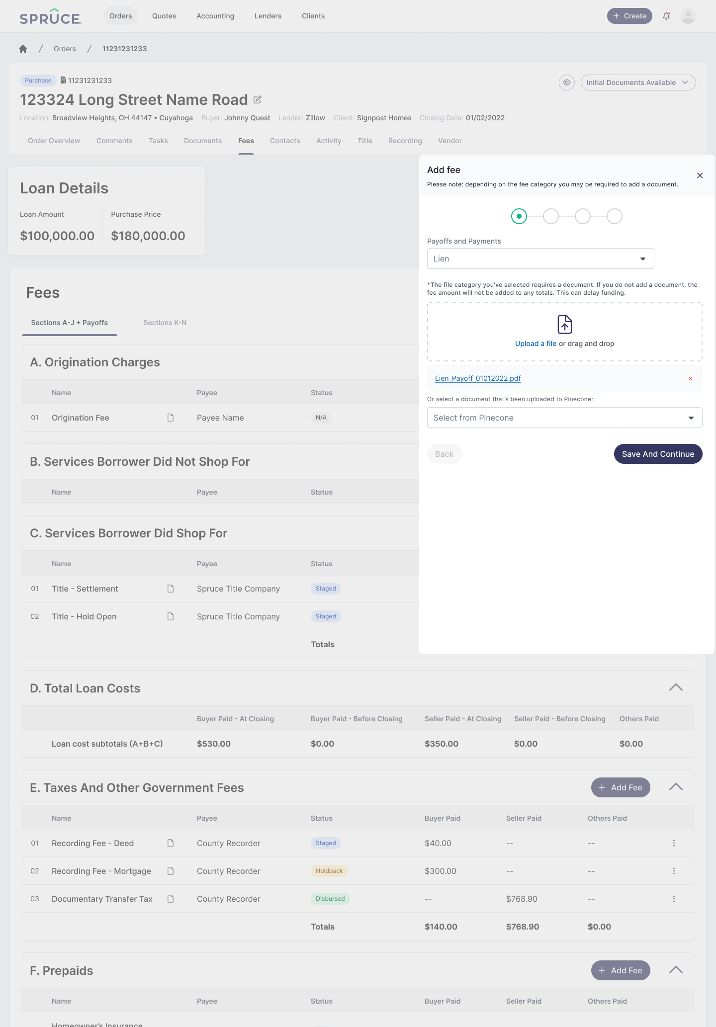
Streamlined Inputs: Reduced the number of inputs to avoid clutter and minimize errors caused by the cumbersome, outdated process.
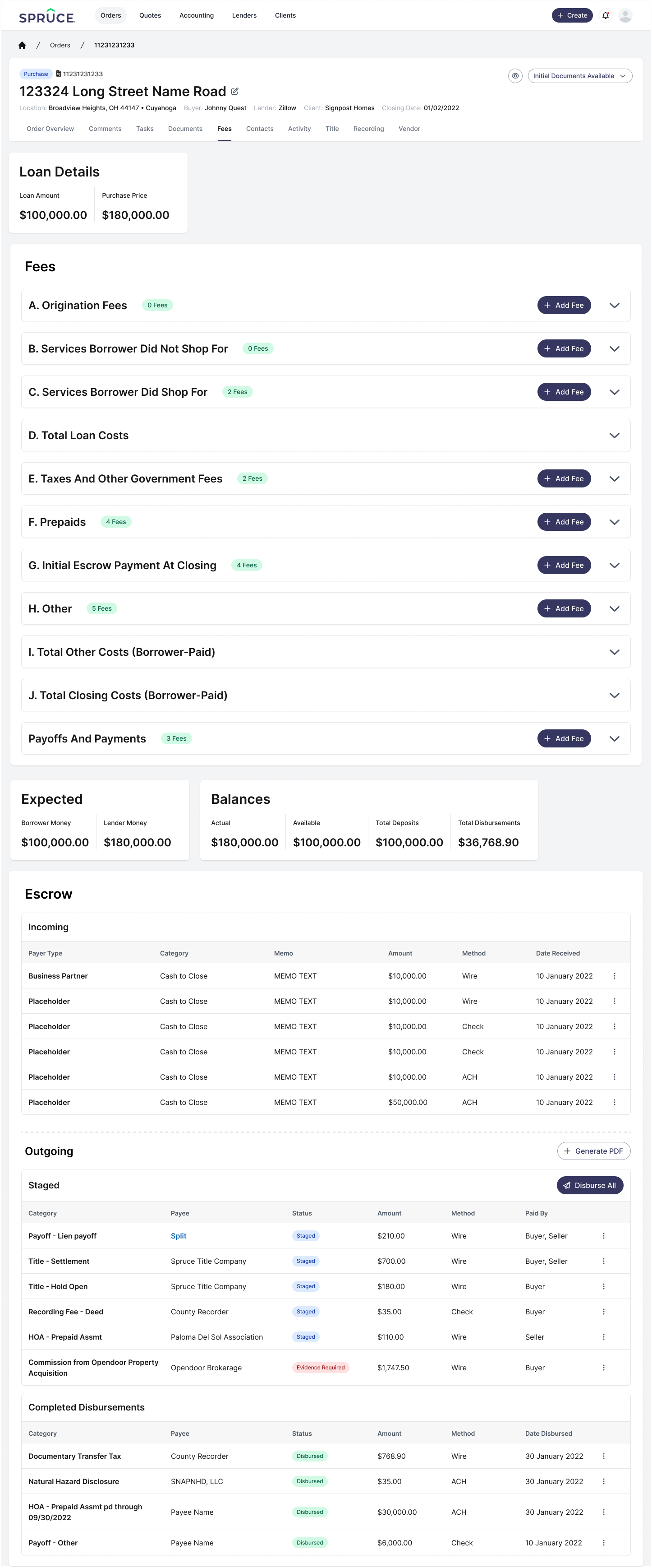
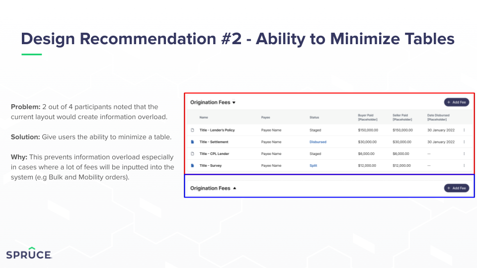
Collapsible Cards: Introduced collapsible sections so users can hide what they don’t need, keeping the interface clean and focused.
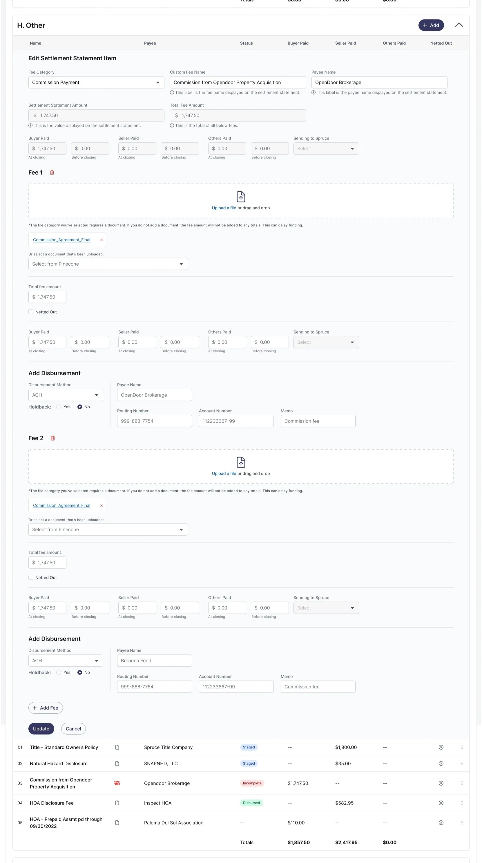
Status Indicators: Added colored pills to show the status of each line item, such as "staged," "ready for disbursement," "disbursed," or "incomplete." These statuses are automatically updated based on system criteria.
Visual Cues: Icons indicate an item’s standing, whether it has a linked document, and other key details at a glance.
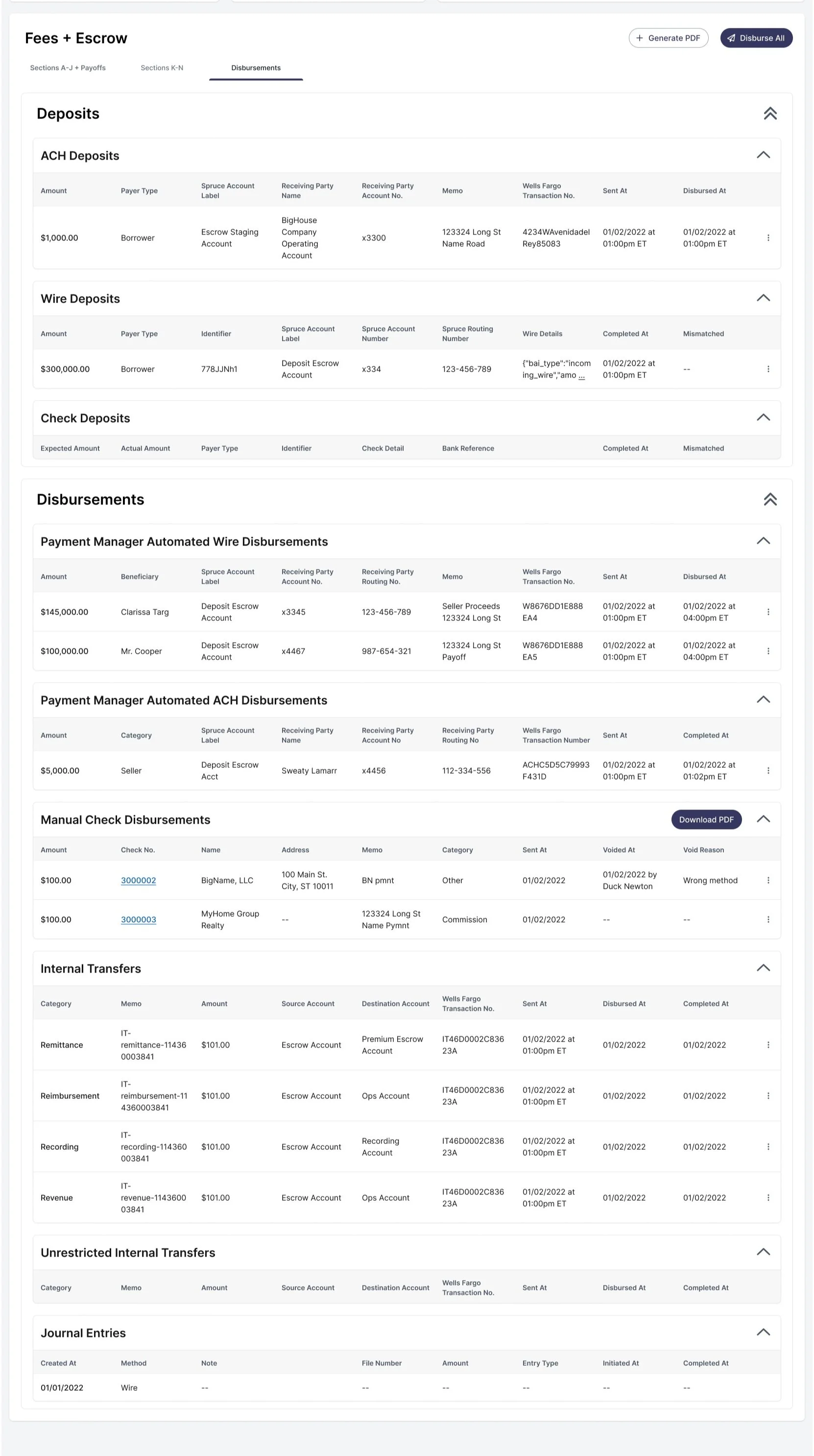
Enhanced Disbursement Options: Users can now disburse individual line items or all at once. For bulk disbursements, the system prevents incomplete items and allows users to hold back specific entries.
Integrated Check Printing: Checks can be printed immediately during disbursement or revisited later.
Document Management
Linked Evidence: Users can attach documents or evidence directly to items, eliminating the need to dig through Pinecone, emails, or Slack. Evidence can be added ad hoc or linked from the documents tab if already uploaded.
Improved Usability
In-Line Editing: Testing confirmed that users prefer in-line editing over handling multiple input fields, allowing for quicker adjustments.
Overage/Shortage Reconciliation: Users can easily adjust for overages or shortages, instantly reimbursing or charging accounts for discrepancies.
After months of testing, iterating, late nights, and way too much instant ramen, we delivered designs that delighted stakeholders. Even the CEO, Patrick, showcased our prototype to investors—a major milestone for the team.
This project was a massive collaborative effort and is currently being built. While it’s not perfect, it’s a significant improvement. As users provide more feedback, we’ll continue refining the experience to meet their needs.
Here’s all the details:
The team
The product team for this project was small, as usual:
product designer (me)
product manager
technical product manager
ux researcher
We worked with an overall “core team” comprised of stakeholders outside of the product/design team, but working with them directly fell onto the PM’s shoulders. That said, I did provide weekly updates and demonstrations all throughout the process via check-ins.
My role
Mid and High-Fidelity Wireframes
This was a high-priority, high-visibility project with a tight deadline. To save time, I focused primarily on high-fidelity prototypes to ensure clarity and alignment with the team’s goals.
Prototyping (Low and High-Fidelity)
Created extensive prototypes for both user testing and core team presentations, ensuring designs were actionable and user-focused.
Collaboration with the Core Team
Given the importance of this project, close collaboration was critical. I regularly shared updates, provided video walkthroughs for engineers as a reference, and held "office hours" to address questions and gather feedback.
I also presented updates not only to stakeholders and the core team but to the entire company to keep everyone aligned.
Design QA
Worked closely with the QA team and frontend engineers to ensure the final product met design specifications. This included verifying clickable areas, colors, animations, and spacing to maintain quality and usability.
We had some challenges
Problems to solve
User-Driven Priorities and Deliverables
Through multiple meetings and brainstorming sessions with stakeholders and users, we aligned on what users wanted, what they needed, and what we could realistically deliver:
Building Fees (Settlement Statement Items):
Selecting the category.
Choosing the ledger code.
Adding labels for better clarity.
Attaching payment instructions.
Entering dollar amounts.
Associating documents by either attaching them directly or linking already uploaded files.
Tracking Balances:
Displaying expected deposits, actual total deposits, and total disbursements in one centralized view.
Generating Key Documents:
Allowing users to generate a Closing Disclosure (CD) or settlement statement directly from the new tab instead of waiting for the system to auto-generate after every change.
Streamlining Disbursements:
Adding the ability to hold back specific disbursements.
Grouping disbursements for easier management.
Enabling simultaneous selection of which disbursements to process and which to hold back.
Auto-Save:
Implementing an auto-save feature to prevent data loss and reduce manual effort.
Early iterations
[v1 had this (admittedly rough) sidesheet for adding settlement statement items - it tested poorly and frankly was not my best idea. forcing users through a wizard was time consuming. this was definitely not my best work, but it made me really stop to think about the user’s experience and not just making something different to what we had.]
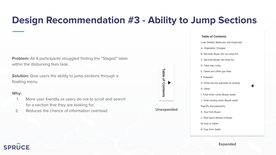
[v2 was a step in a different direction - it tested better than v1, but we learned users needed the expected and balances cards to be present up top, and weren’t AS interested in incoming and staged items as we thought. also? too much scrolling.]
And we came up with some solutions
The usability tests
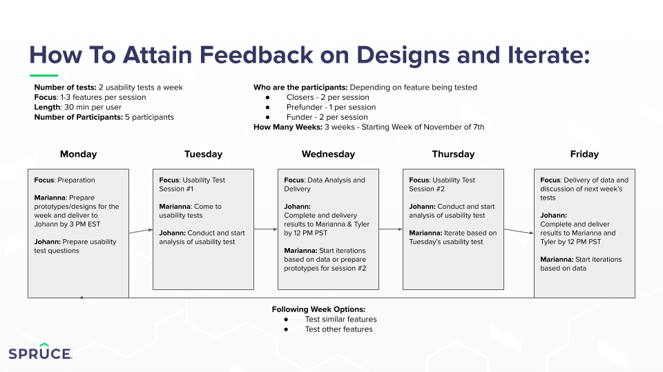
We had ~30, 30-45-minute usability tests with various Spruce employees, all of whom worked within the fees/escrow tabs extensively. Tests took place over four weeks, and several different scenarios were tested.
Understandably, there were a lot of changes to be made! In the end, the final design scored 89-92 points for SUS.
A quick prototype
After our user testing and interviews, we decided on this final design.
The whole walkthrough is extensive, so this just demonstrates a quick action of adding a single fee.
Ultimately, I think more feedback will come out once this has been built, and i think designs always have room to grow and improve, but i think this provides a much better experience for our users.
