Spruce | Digital Clear to Close Workspace
Designing a clear to close workspace.
The digital clear to close [dc2c] work was meant to alleviate the pain points of the exam and curative teams by providing them a new workspace, designed from scratch.
The shared goal of the Exam and Curative teams is to ensure clear and legally valid property ownership before a sale or transfer, protecting all parties from potential title defects. By collaborating, these teams can ensure the title is free of defects and that everyone involved has the necessary information to move forward with the transaction.
However, these teams currently lack a unified workspace. Their work is spread across multiple pages in the internal tools app (Pinecone) and various third-party apps (Front, Slack, Sheets, Confluence), leading to increased error rates, low transactional capacity, and a poor overall work experience.
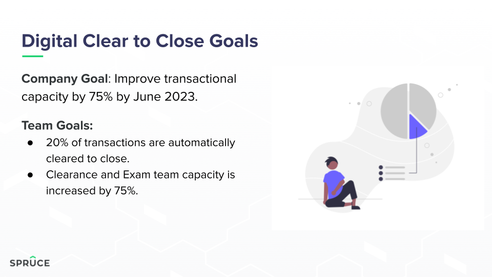
As the lead designer, my task was to create a new workspace tailored to the needs of these teams. I had to design a space that was not only efficient and user-friendly but also aligned with the DC2C team’s goal of improving transactional capacity by 75%.
I collaborated closely with the company’s UX researcher and the product manager overseeing this team. The researcher and I regularly met with users from the Exam and Curative teams to gather feedback, iterate on designs, and refine the user experience before presenting our work to the PM and other stakeholders.
tldr: i was the product designer for a new workspace for two specific teams at the company. i needed to devise new UX and UI to provide a more concise means of clearing title.
The current workflow is Not Great ™️
Right now, users have to navigate multiple pages in the internal tool and third-party apps to complete title clearance work.
Some of this is unavoidable—like ordering payoffs from other institutions or using county-specific portals for information. However, much of it stems from bad design decisions (made before my time, just saying).
Current Workflow Pain Points:
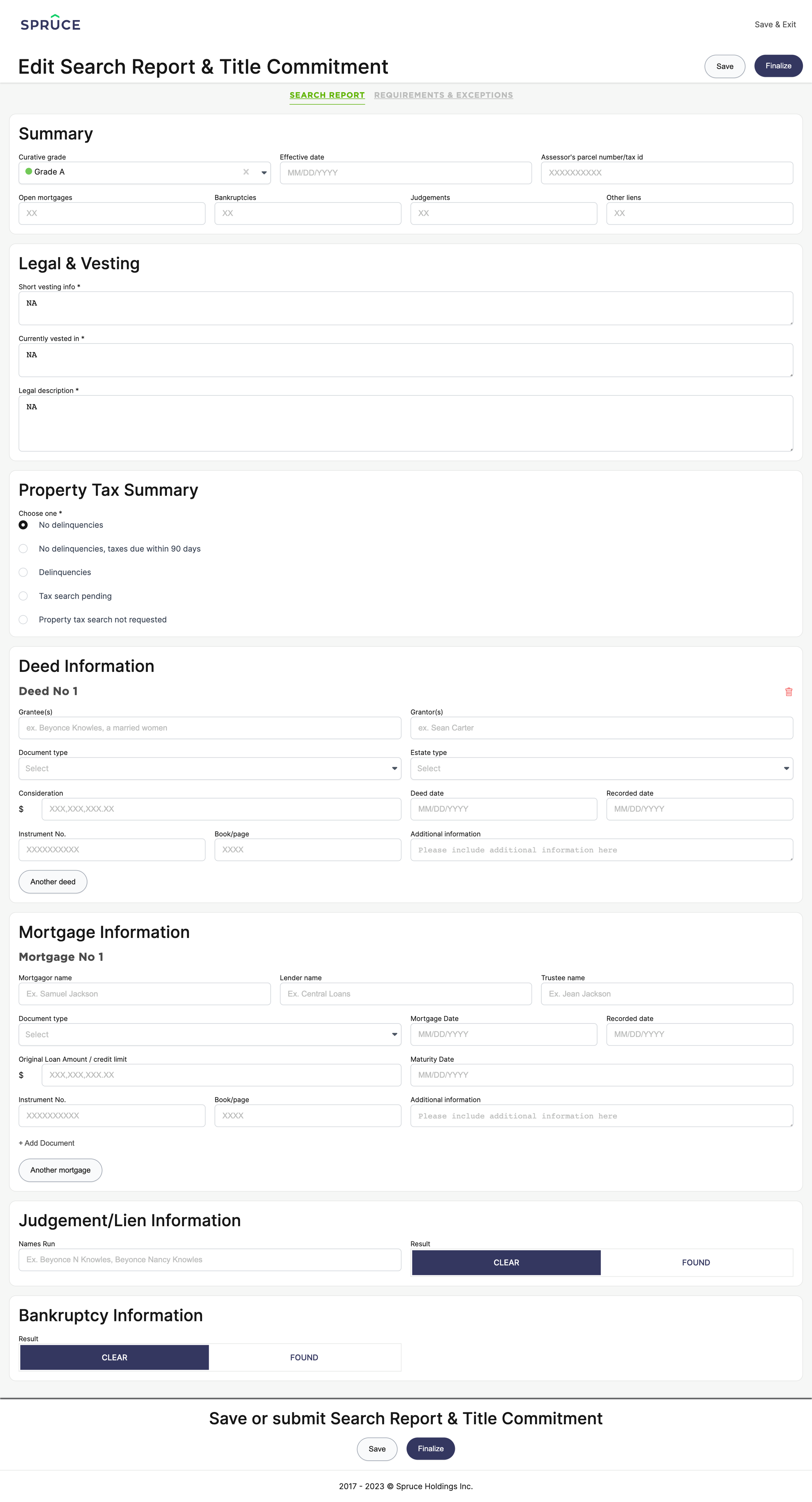
Duplicative Work: The same information must be entered in multiple locations to generate a single document, which is inefficient and error-prone.
Excessive Access to Final Products: Users have too much access to manipulate the finished product (title commitment), which can lead to mistakes and unnecessary notifications sent to lenders and clients when changes are made.
Lack of Structure and Communication: There’s no clear structure for managing tasks and communication between the Exam and Curative teams, causing confusion about who is responsible for what and when it should be done.
Cumbersome Workflow: Too much time is spent searching for information, leading to unnecessary delays and frustration.
These pain points have led to decreased operational efficiency, processing delays, revenue loss, strained client relationships, and, of course, grumpy Exam and Curative team members.
this looks like crazy gibberish
Here’s what I’m thinking
New Title Page
Sub-Navigation: Introduced sub-navigation to support multiple pages within the title section for better organization.
Overview Page: Updated with key information requested by the Exam and Curative teams to improve visibility and accessibility.
Enhanced Cards: Added new cards with more detailed information, in-line editing capabilities, and dedicated comments sections.
Comments Section
Task-Specific Comments: Created a comments section specifically for clearance work to reduce clutter from unrelated comments in the overall file.
Threaded Replies: Enabled replies to comments for clearer communication and added links to the relevant cards where comments are left.
Commitment Builder Updates
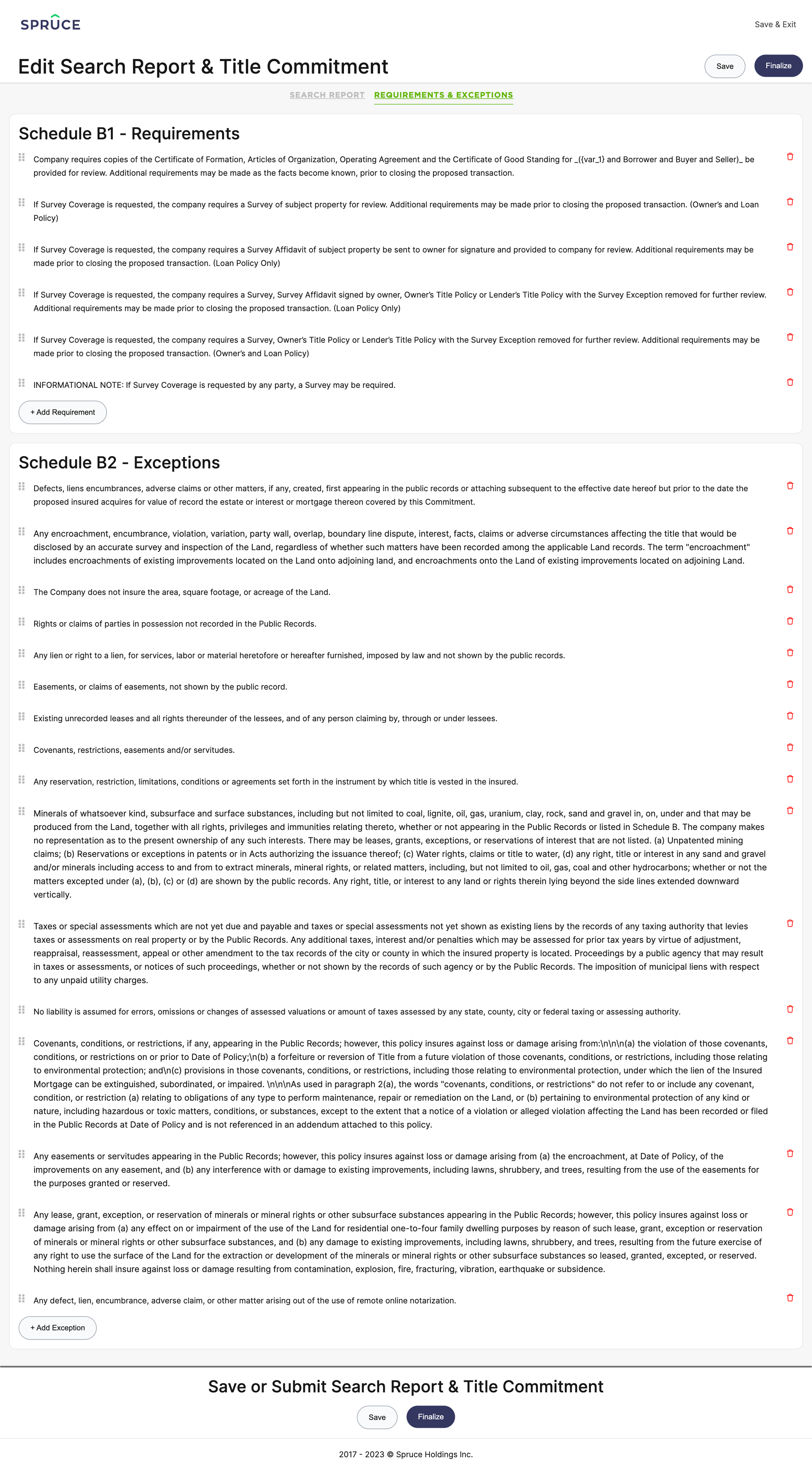
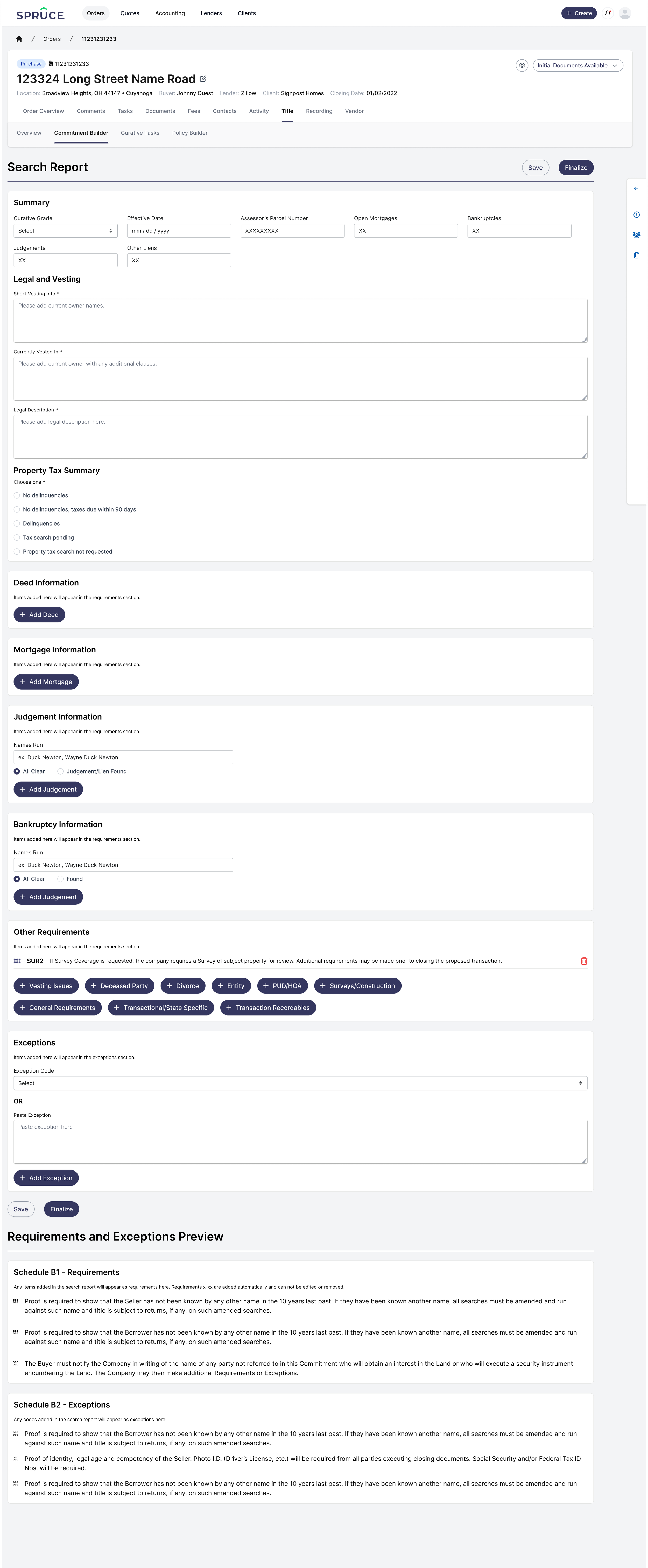
Dropdown Menus for Codes: Replaced copy/pasting of requirement and exception codes from Confluence with dropdown menus for quicker selection.
Flexible Editing: Allowed users to edit and reorganize exceptions and requirements directly within the builder.
Curative Workspace
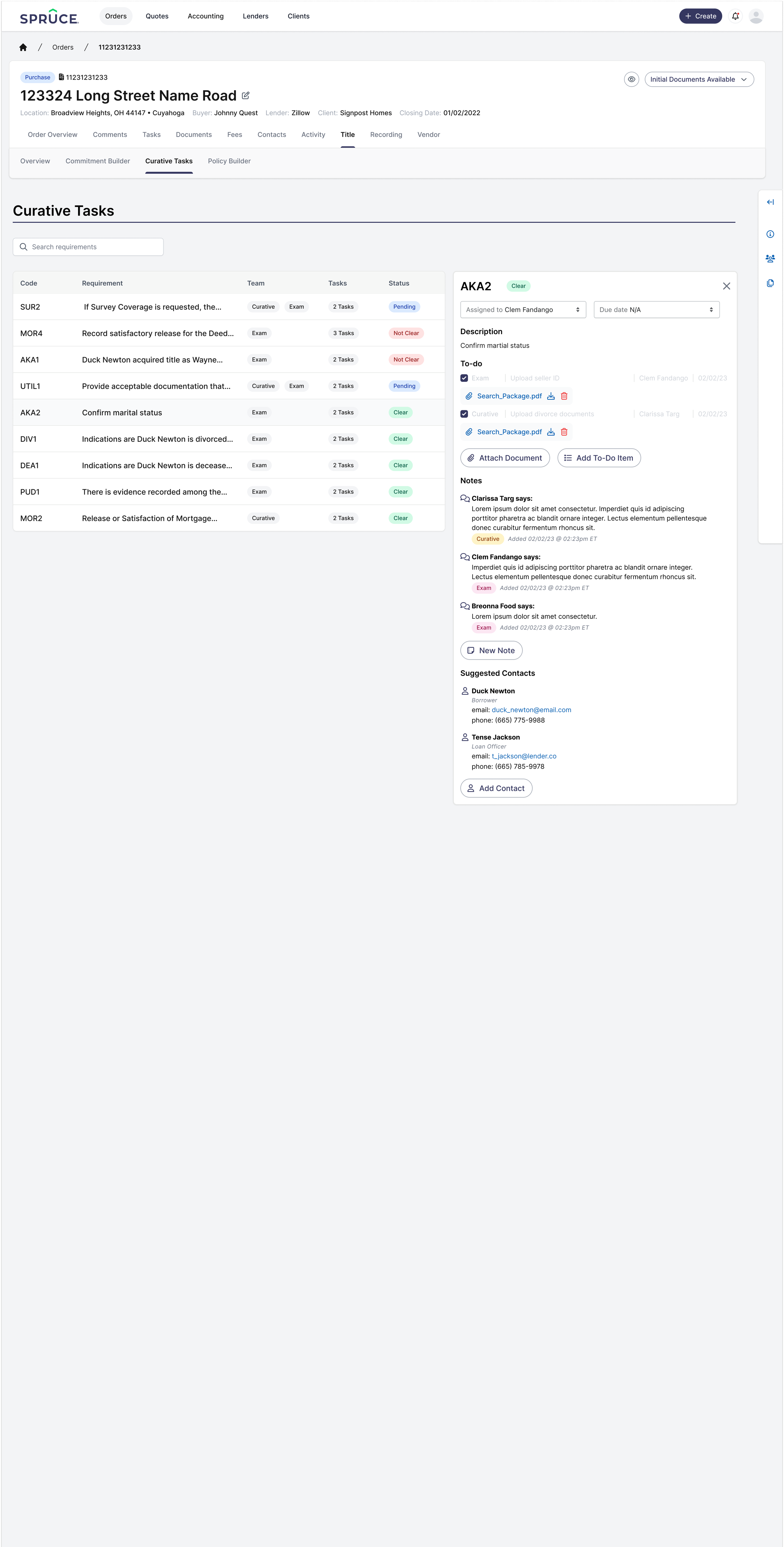
Automated Task Cards: When a requirement is added to the commitment builder, a corresponding card is generated in the curative workspace with all necessary tasks to clear it.
Comprehensive Functionality: Within the cards, users can leave notes, mark tasks as complete, contact stakeholders, attach documents, add tasks, and assign the requirement to team members.
Sidebar with Quick Info
Collapsible Sidebar: Added a collapsible sidebar with quick links to related Confluence articles, documents, contacts, and other resources for easy reference.
After extensive user testing, interviews, and brainstorming sessions, we refined these features to better address user needs, creating an intuitive workspace that incorporates and enhances the necessary tools for title clearance work.
Let me know if this feels aligned or if you’d like further changes!
Here’s all the details
The team
A small team, but a good team!
product designer (me)
product manager
ux researcher
We worked with an overall core team comprised of stakeholders throughout the company and engineers, QA team members, etc, but the PM/UX reasercher/myself worked together most closely on the designs and testing.
My role
High-Fidelity Wireframes
Straight to the Good Stuff: Due to a tight timeline, I skipped low-fidelity wireframes and focused on delivering polished high-fidelity designs from the outset.
Prototyping (Low and High Fidelity)
Conceptual Prototypes: While not all pages had high-fidelity wireframes, I created low-fidelity prototypes to illustrate concepts and facilitate productive discussions during PM check-ins.
Collaborating with the Core Team
Close Collaboration: Worked closely with all core team members to gather feedback, iterate on designs, provide walkthroughs, and ensure consistent communication throughout the process.
Presenting
Frequent Updates: Collaborated with the PM and UX researcher to regularly present findings and updated designs to the core team, which included key stakeholders outside of the product and design teams.
We had some challenges
Problems to solve
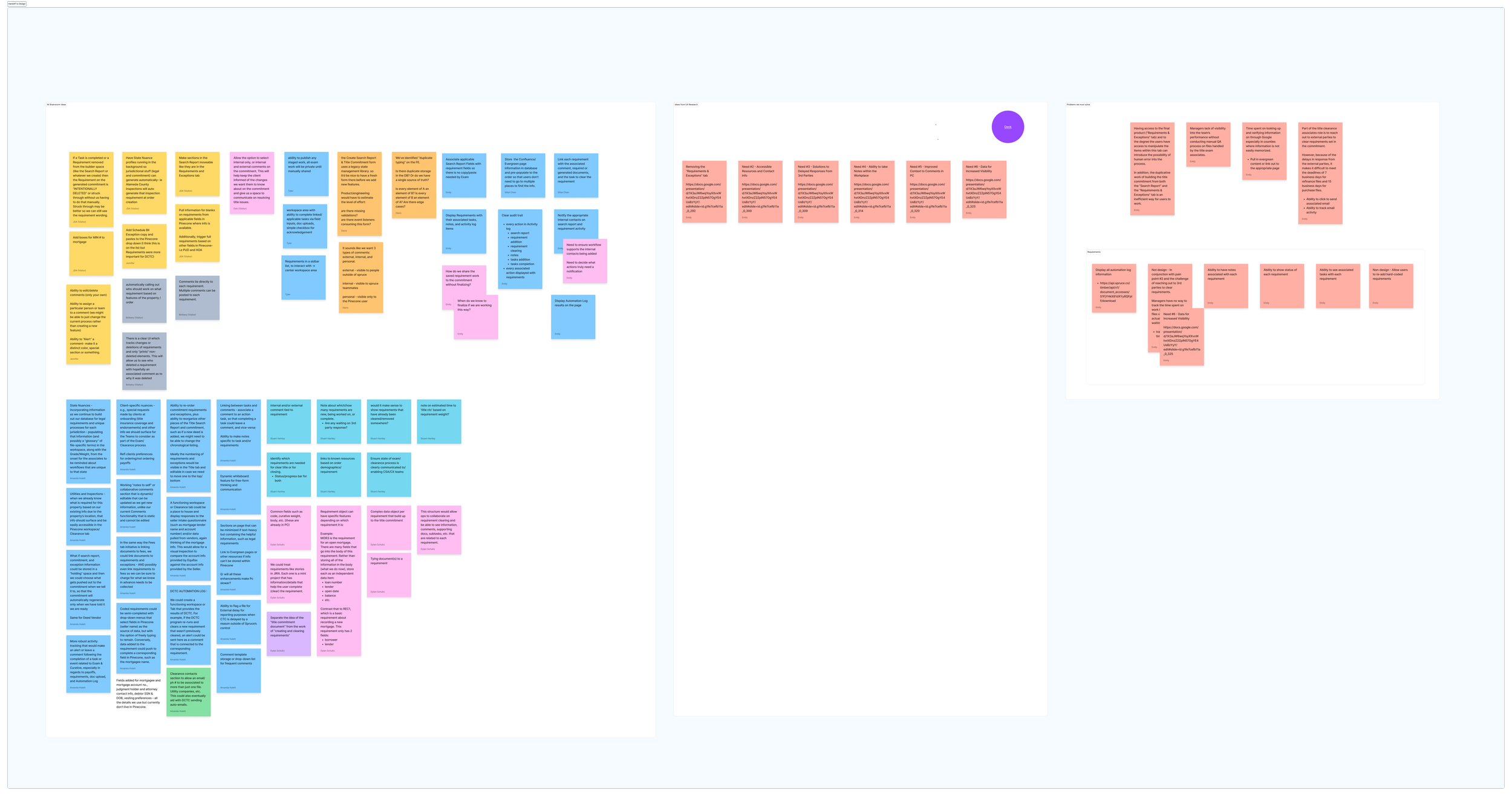
After several meetings and brainstorming sessions with stakeholders and users, we reached a consensus on what our users needed, wanted, and what we could realistically deliver:
Access to Final Product: The extensive access users have to the “Requirements & Exceptions” tab, including the ability to manipulate items within it, increases the risk of human error.
Duplicative Workflows: Building the title commitment requires duplicative efforts across the “Search Report” and “Requirements & Exceptions” tabs, creating inefficiencies and frustration for users.
Limited Manager Visibility: Managers lack real-time insight into team performance and rely on manual QA processes to assess the work handled by title exam associates.
Time-Consuming Research: Significant time is spent looking up and verifying county-specific information through Google, particularly in areas where data isn’t easily accessible or standardized.
Suggested Solution: Integrate Evergreen (internal Confluence) content directly into the tool or provide links to relevant pages for quick access.
Challenges with External Communication: Title clearance associates often face delays when reaching out to external parties to clear requirements listed in the commitment, making it difficult to meet deadlines (7 business days for refinance files, 15 for purchase files).
Suggested Solutions:
Add a one-click email feature for contacting external parties directly from the tool.
Introduce email tracking to monitor communication activity and improve accountability.
Requirements
Improved Requirement UI
Notes for Each Requirement: Users can now add and view notes directly associated with individual requirements for better context.
Requirement Status: Clearly display the status of each requirement (e.g., in progress, completed) for streamlined tracking.
Task Visibility: Easily see tasks tied to specific requirements, ensuring nothing falls through the cracks.
Assignment Features: Assign requirements to team members and quickly view who’s responsible for each one.
Clear Audit Trail: Automatically log user actions like leaving comments or marking tasks as complete, making the workflow transparent and traceable.
Manual Publishing: Allow users to manually publish their work to prevent unnecessary notifications to lenders or third parties.
General Guidelines
Working Within Constraints: While I had the freedom to redesign pages, incorporating pop-up notifications for replies or assignments was strictly off-limits (to quote the PM: “Absolutely not, do not do that. I can’t open that can of worms again.”).
Balancing Creativity and Practicality: My excitement for new designs had to be tempered by close collaboration with the team to ensure my work aligned with their needs and goals—“Don’t go too wild, Marianna” was a frequent and helpful reminder.
And we had some solutions
The usability tests
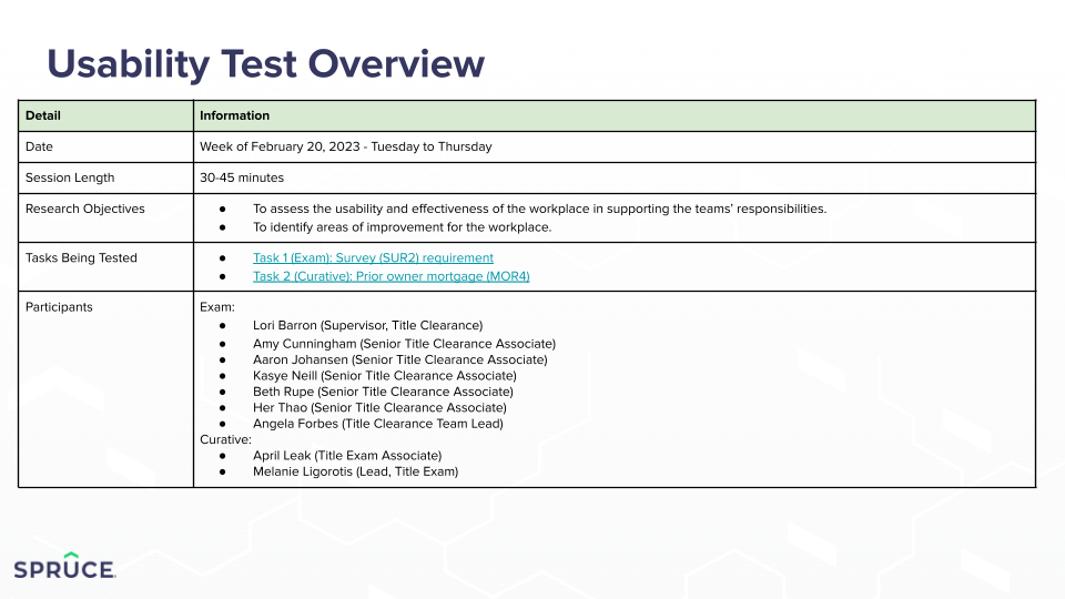
We conducted nine 30-45 minute usability tests with exam and curative team members, asking them to complete two distinct tasks. Here's what we learned:
Overall Design Feedback:
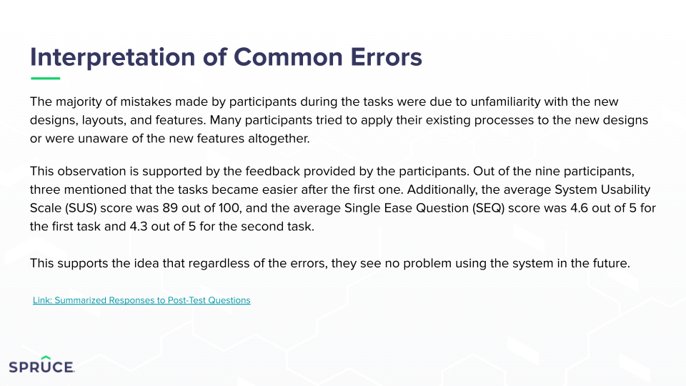
Scored 89/100 on the SUS scale.
Described as “intuitive,” “self-explanatory,” and “very easy.”
One participant remarked, “Way less bouncing back and forth,” which was exactly what we aimed to fix.
Task 1: Adding a Survey Requirement to the ‘Other Requirements’ Section and Following Up with Borrower/Third Party
Key Metrics:
11 total errors.
Average completion time: ~3 minutes.
Single Ease Question (SEQ) score: 4.6/5.
Feedback Highlights:
“Pretty self-explanatory.”
“Way less bouncing back and forth.”
Task 2: Reviewing a Prior Owner Mortgage Document and Requesting an Owner’s Policy Copy from the Borrower
Key Metrics:
22 total errors.
Average completion time: ~200 seconds.
SEQ score: 4.3/5.
Feedback Highlights:
Participant 2: “Consistent with the first task.”
Participant 3: “Liked all the new features and that it was all accessible.”
Participant 6: “Made a lot more sense after the first task.”
Participant 7: “Easier after doing it once.”
Participant 8: Called it “user-friendly” and “streamlined.”
Love to see it.
My final prototype
After our user testing, interviews, and bargaining with the engineering team, we decided on this final prototype.
Folks were pretty excited about it, and I am too! As always, I think it will need to be updated as users actually work with it, but I think it provides what they were looking for and will help alleviate some of their stressors.
