Spruce | Consumer Dashboard Redesign
Redesigning the company’s Consumer Dashboard.
The company’s fee and escrow pages were Not Great™️. I had a responsibility to not only improve the user experience and interface, but also add in a bunch of new features.
Reimagining and combining the fee and escrow pages of Pinecone, the company’s internal tool, was a complex project designed to help Spruce employees work more efficiently, support sustainable growth, and prevent issues like audits and accounting errors.
As the lead designer, my role was to merge two separate pages into a unified experience. I focused on removing redundant elements, like having to input the same information across multiple pages, and adding user-requested features, such as easier fund disbursement and more visible calculations. Working closely with our UX researcher, I was able to better understand the financial lifecycle of our orders and ensure the final designs met user needs.
Throughout the project, I collaborated with our UX researcher and two product managers, conducting user interviews across multiple teams to gather feedback and refine designs. Once the designs were finalized, I handed off milestones to the engineering and QA teams, walking them through the designs and functionality in detailed sessions. To make the transition smoother for both users and engineers, we broke the project into two milestones (M1 and M2), making the overhaul more manageable and the new workflows easier to adopt.
tldr: I was the product designer for a massive overhaul of our fees and escrow pages. The work was broken into two deliverable milestones - M1 and M2.
A consumer dashboard is essential for this proptech company to stand out from other title companies. The current experience left much to be desired, so I was brought on to give it a much-needed refresh.
The dashboard is an in-house platform designed to provide consumers—homebuyers, sellers, and those refinancing—greater visibility and control throughout their closing process.
As the lead designer, this project felt like a complete gut renovation. My goal was to transform a stressful experience into a more enjoyable one by delivering a thoughtfully designed interface and an improved user experience. I conducted competitive analysis and user interviews to ensure the updates truly addressed pain points and added value.
tldr: I was the product designer for an update to our customer login portal. I needed to update the UX and the UI and provide a delightful and more streamlined approach to real estate transactions for homeowners.
The current dashboard is a rough experience
The consumer dash currently allows folks to:
Indicate signing appointment preferences
Select a preferred date, time, and location through simple form fields.
Link a bank account for transactions
Securely link accounts for sending and receiving funds using Plaid integration.
Review documents in advance
Access and review documents ahead of signing appointments for added clarity and preparation.
Here’s what I’m thinking
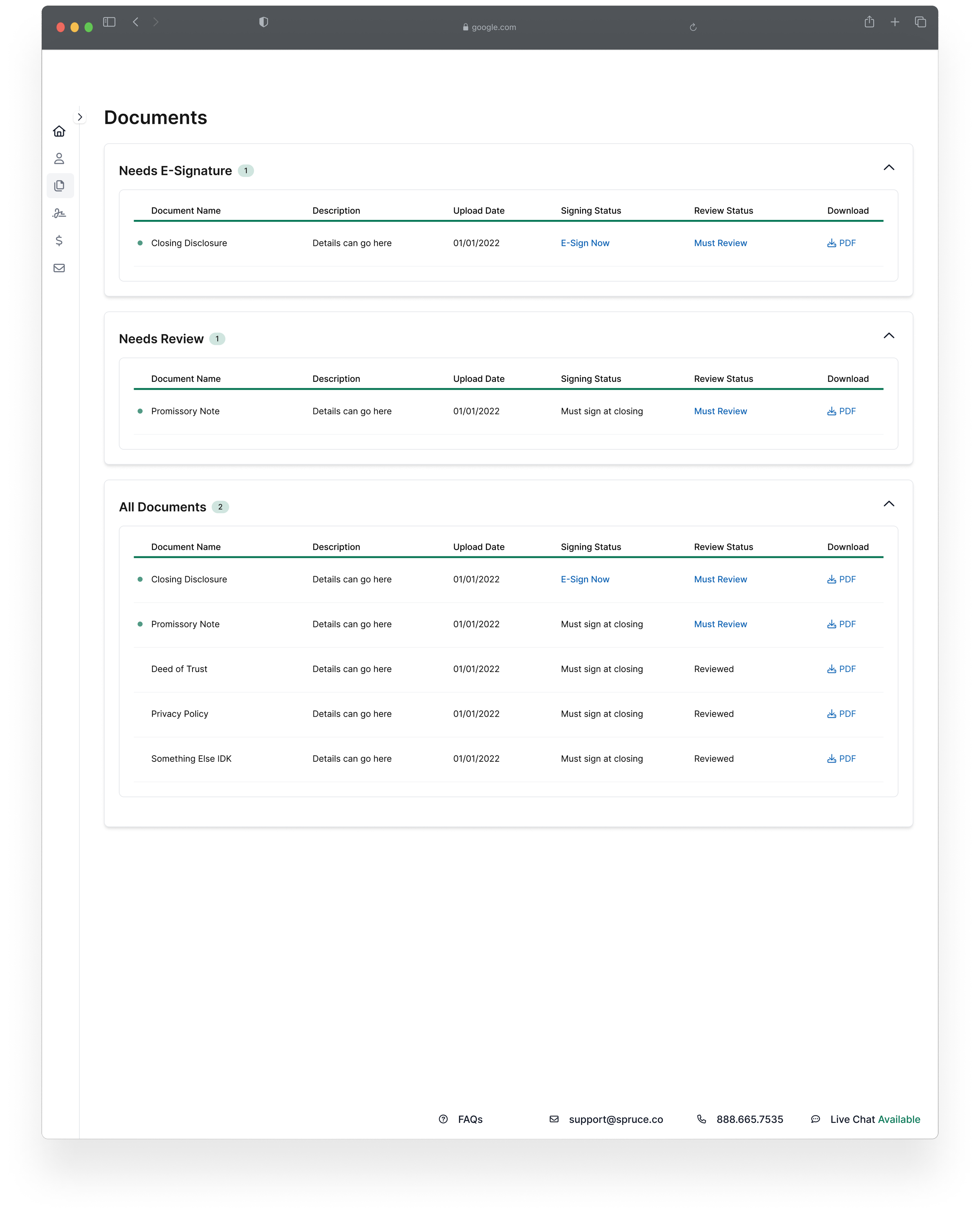
New Document Page
Clearly indicate which documents can be eSigned and which need to be reviewed.
Provide a "Download All" option to save documents as PDFs for convenience.
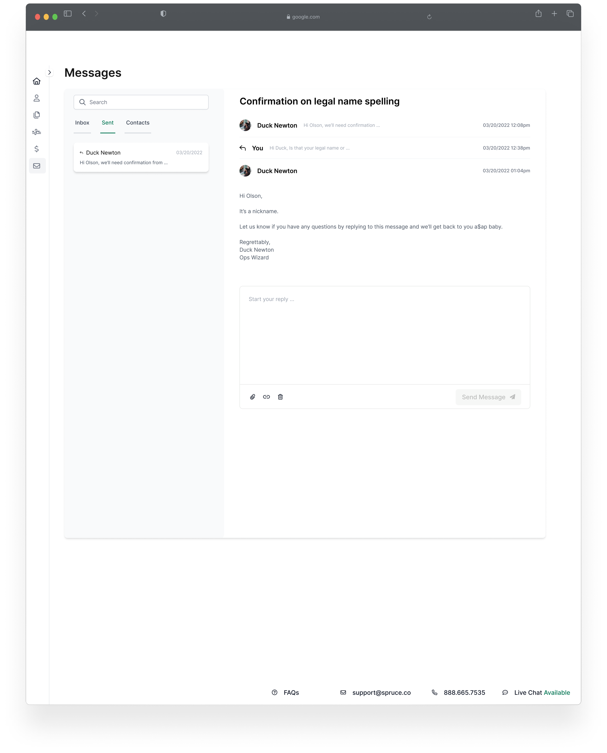
Add Secure Messaging
Enable direct communication between consumers and their loan officer or relevant employees within the dashboard.
Centralize messages to eliminate the need to search through email threads for past conversations.
Enhanced Loan Proceeds Page
Allow consumers to select from multiple payment methods and display estimated delivery dates.
Clearly show linked account details and the selected payment method for transparency.
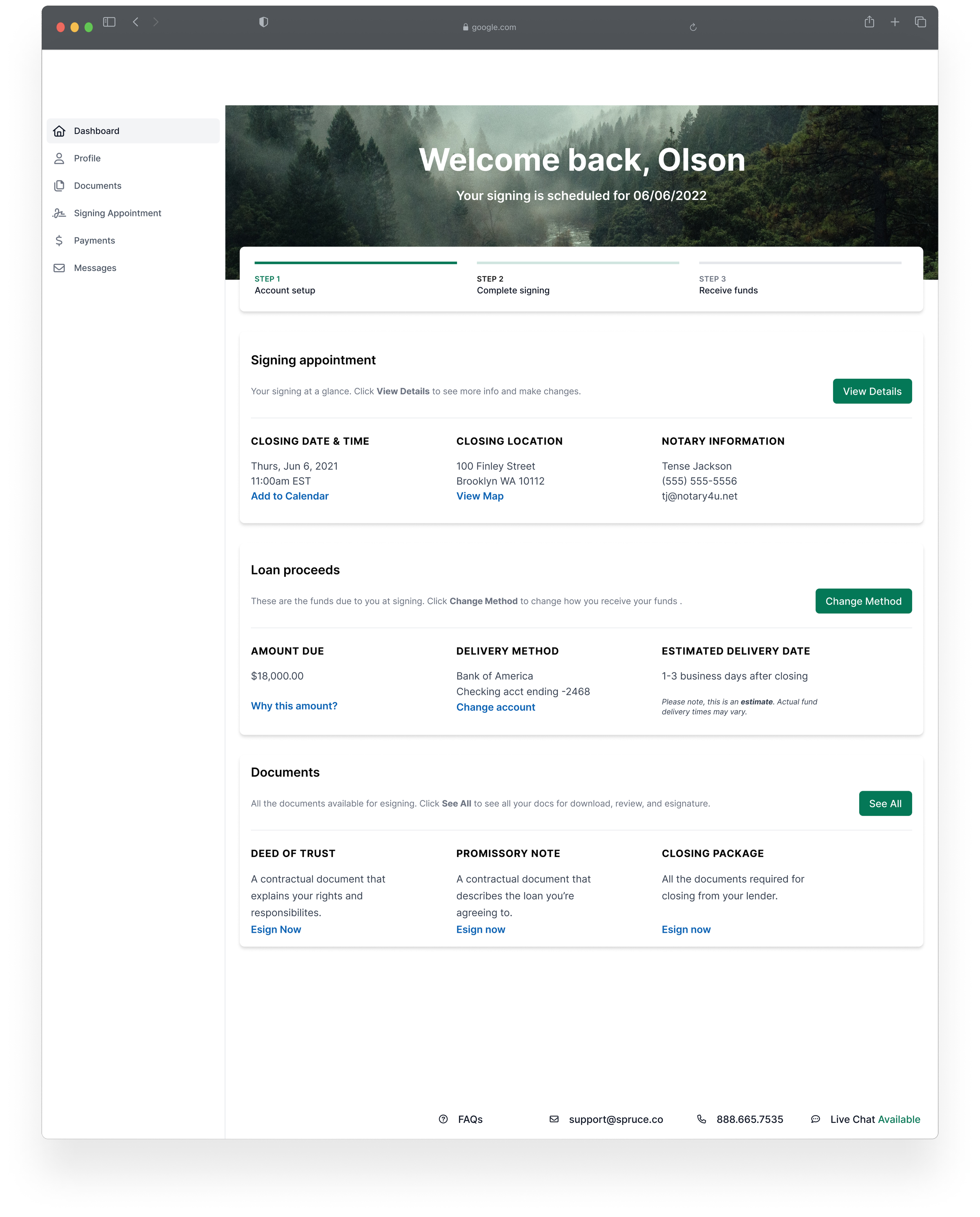
Improved Homepage
Display the transaction status at a glance (e.g., "Signing Scheduled," "Funds Sent").
Provide a snapshot of all critical information, including:
Signing appointment details.
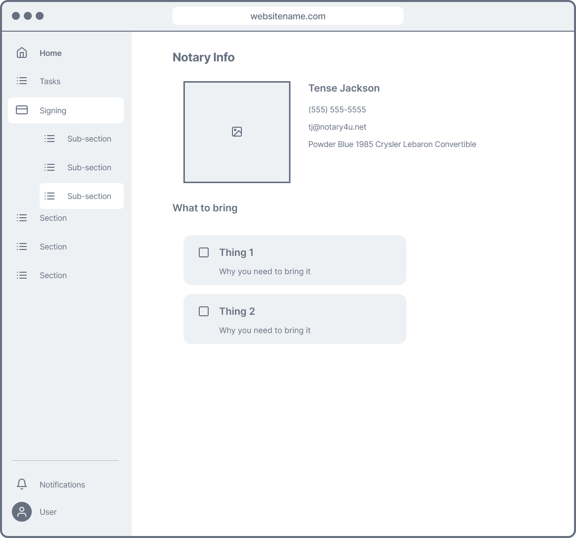
Notary information.
Funds due at signing.
Documents requiring attention.
Some notes on the solutions
While the approach shares similarities with the redesigned Pinecone Documents Page, the user base and needs here are distinct.
The current design doesn’t support document uploads yet, but this functionality could be added in a V2 update after thorough testing and iteration.
here’s all the details
The team
This project took place before the company adopted the core team structure, so it was a very small team working on this:
product designer
product manager
ux researcher
frontend engineer
My role
Accidentally Becoming the Subject Matter Expert
Given my previous experience working on a marketing prototype/demo for this application, I had a deep understanding of how it was supposed to function.
I spent significant time in the staging environment, documenting processes with videos and detailed notes, which made me the go-to person for answering questions about how the system worked (or didn’t).
Low and High Fidelity Wireframes / Prototyping
While not every page had high fidelity wireframes, I was able to create a solid low-fidelity conceptual prototype to demonstrate key ideas and workflows.
Collaborating Directly with the Frontend Engineer and PM
I kept the PM and engineer updated with design changes and updates throughout the process, ensuring clear communication and alignment. I prefer to avoid surprises and unnecessary rework by keeping everyone in the loop on new features or workflow adjustments.
We had some challenges
The dash problem
As mentioned, our task was to refresh the consumer dashboard—both with a visual overhaul and a revamped user experience.
The goal was to create an experience that aligned with our brand’s mission: simplifying the title insurance process and the real estate journey as a whole. The dashboard was intended to not only appeal to current clients (lenders, in this case) but also serve as a key differentiator in a competitive market.
At the time, the dashboard lacked updated brand assets and didn’t offer the best user experience, even for those who were already fans of the app.
Project restraints
User restrictions: We were instructed not to speak with users who rated us below 5 stars or any of our current lenders. The sales team specifically requested that we avoid interviewing anyone with lower ratings (which reduced our pool of interviewees from 17 to just four) and cautioned against reaching out to existing lenders due to concerns about “promising features we might not be able to deliver.”
Limited responsiveness: We were only able to design for desktop, as the mobile version wouldn’t be feasible until we had a dedicated mobile engineering team.
Creative limitations: "Don’t go too wild, Marianna." As much as I enjoy creating delightful experiences for users, I had to temper my creativity and stay in close communication with the team to ensure I was designing something we could realistically build.
We had some solutions
The interviews
We conducted four 60-minute interviews with users who had interacted with our consumer dashboard in the past three months and given us a 5-star review. The key takeaways from the recordings were:
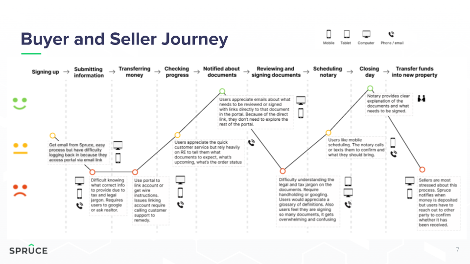
Users struggled to understand the documents they needed to review and sign.
There was confusion about where they were in the process.
They disliked having to access multiple portals (the dashboard and the third-party e-signing website, SignatureSync).
Easy access to customer service was a major priority for them.
Suggested updates
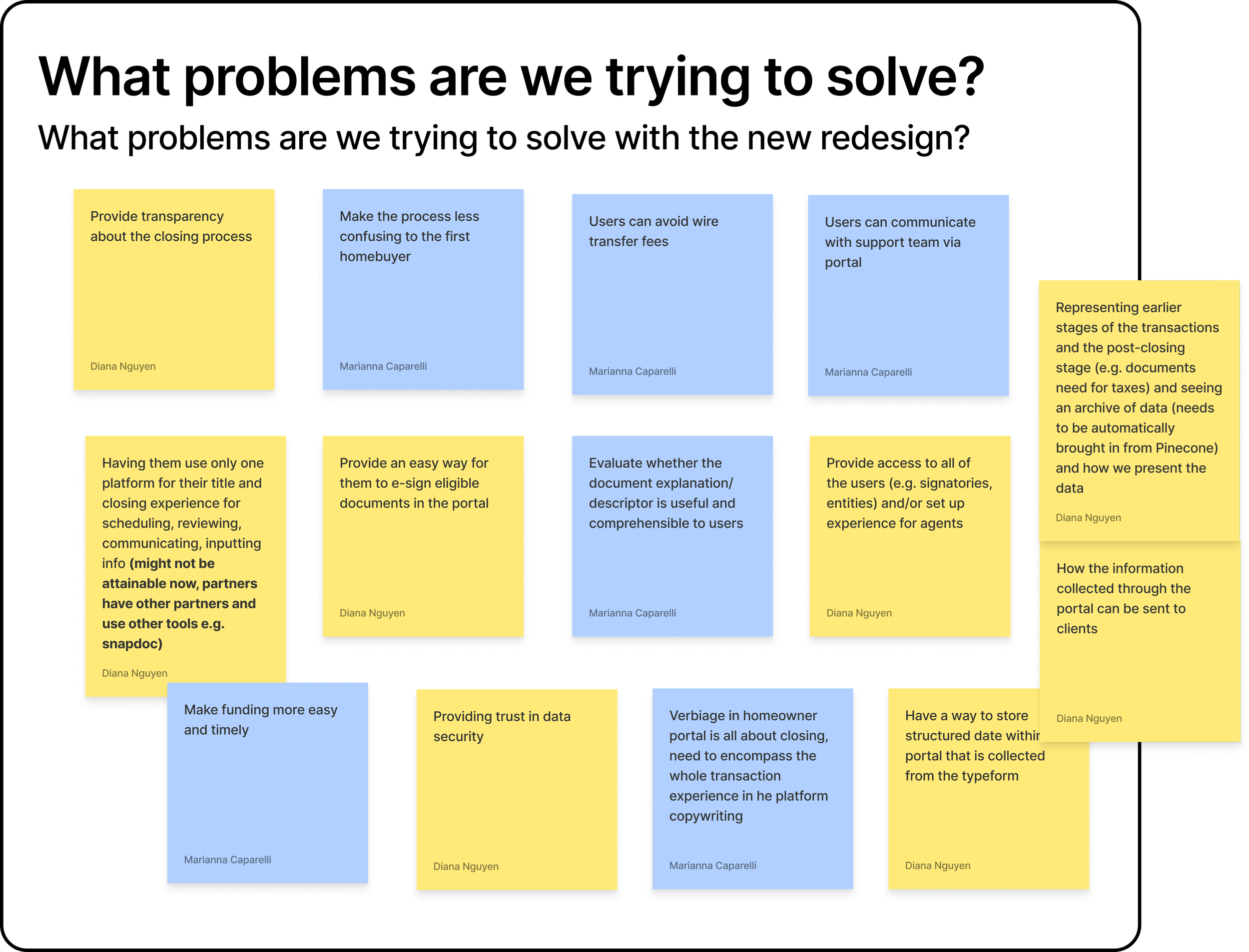
The interviews sparked some ideas for solutions, which I incorporated into the wireframes alongside the reskin:
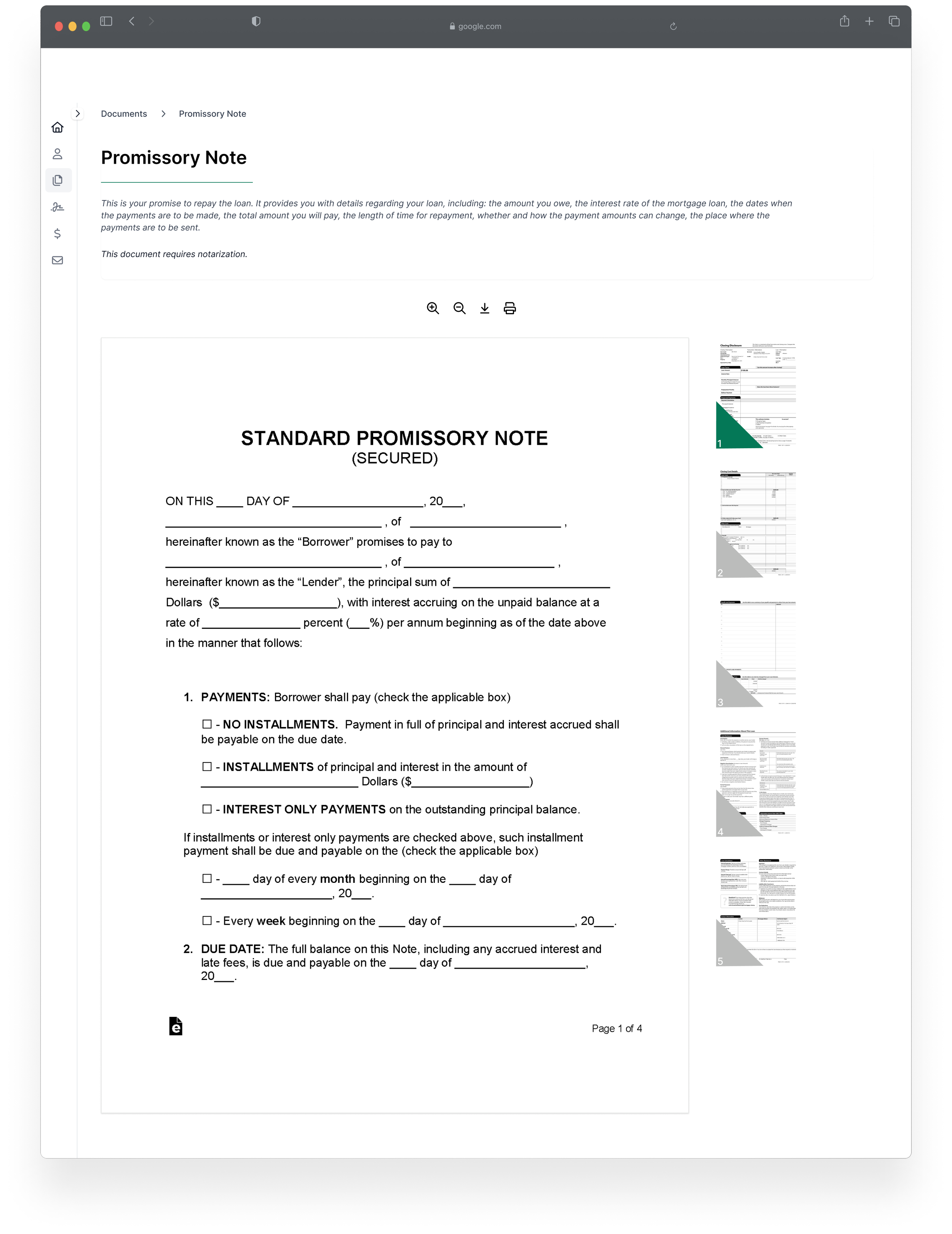
Help text in plain language within document previews to clarify key details.
A status bar with guidance to keep users informed at each step.
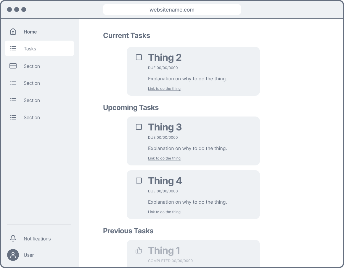
A task section to outline what needs to happen next for the transaction to move forward.
Integration with SignatureSync, allowing users to sign documents directly within the dashboard, eliminating the need to create accounts on external platforms.
A secure messaging system, including an inbox and message center, to facilitate direct communication between users and their lender, employee contact, or anyone else involved in the transaction.
A contact section displaying relevant information, including contact details, location, pronouns, and other pertinent details for added personalization.
A quick prototype
After interviews and feedback sessions and compromises, this is the design we landed on. As with all my designs, I think there’s room for improvement - not because the designs are bad, but because I am not the user, and needs change as users interact with products.

