Spruce | Documents Page Redesign
Redesigning the company’s Documents page.
You don’t realize how many documents are part of a real estate transaction until you have to organize all of them.
Employees at Spruce rely on Pinecone, our internal tool, for most processes during a real estate transaction. The Documents tab is one of the most frequently used features, accessed multiple times throughout each transaction by every real estate operations (ReOps) employee.
However, the tab posed some challenges. Different teams needed different functionalities, documents required varying treatment, and mistakes were common if users weren’t careful. Additionally, the tab didn’t meet all of ReOps’ needs, forcing users to switch between different apps (Adobe Acrobat, Slack, Front) and leaving ample room for error.
As the lead designer for this project, my goal was to create a more organized, efficient, and streamlined document management system within Pinecone. I wanted to reduce the reliance on multiple apps, minimize errors, and speed up document-related tasks for ReOps teams.
tldr: i was the product designer for a major update to our internal documents tool and worked on a cross-functional team. i needed to find a way for users to quickly and effectively sort, edit, download, and share docs in our system to move transactions down the pipeline more quickly.
The docs page hadn’t been updated in a few years
At the start of our work, the Docs page was functional but had several key issues:
Document Uploading: Users could upload documents via drag-and-drop or by selecting files from their computer. However, once uploaded, documents could be “destroyed” or “published,” leading to potential confusion and errors.
API Integration: Clients, lenders, and third-party vendors could integrate with our API, enabling ReOps teams to “publish” documents to external portals for transaction visibility.
Signing & Funding Status: Documents could be marked as “signing” or “funding,” but this label had no functional impact—there were no notifications sent to other teams, and the status could easily be unchecked by mistake.
File Downloading: Documents were downloaded by selecting their file name, but without the option to preview the file before download or any confirmation, this resulted in ReOps teams saving thousands of documents unnecessarily on their devices.
Document Categories: Categories could be selected when uploading, but once the upload was complete, categories couldn’t be edited, making bulk uploads inefficient.
Document Audit Trails: Audit history was available, but it was limited and not user-friendly for tracking document changes.
Affidavit Generation: Affidavits could be generated, but the process was cumbersome and not integrated well with the rest of the workflow.
Consumer Dashboard Integration: Documents could be uploaded to the consumer dashboard for client and vendor viewing, but this feature lacked clarity and consistency.
Standard Document Classification: All documents were categorized as “standard documents,” but no one could define what that actually meant.
Multiple Document Uploads: Only one document could be uploaded at a time, and once uploaded, no edits could be made to the categories, creating challenges for bulk uploads.
Delete Confirmation: The "destroy" option for document deletion lacked a confirmation step, leading to many accidental deletions. If a document was deleted, a bug report had to be submitted for recovery with the help of an engineer.
Here’s what I’m thinking
Documents and data tables may not be the most exciting (lol), but they’re at the heart of real estate transactions, and getting them right is critical. While this shares some similarities with my work on the consumer dashboard, the user experience here is tailored to a completely different group (ReOps employees vs. homeowners). I believe this update strikes a solid balance between a clean UI and a UX that addresses key pain points.
So, after gathering plenty of feedback, tinkering in the staging environment, and running some light user tests, here’s my most recent iteration:
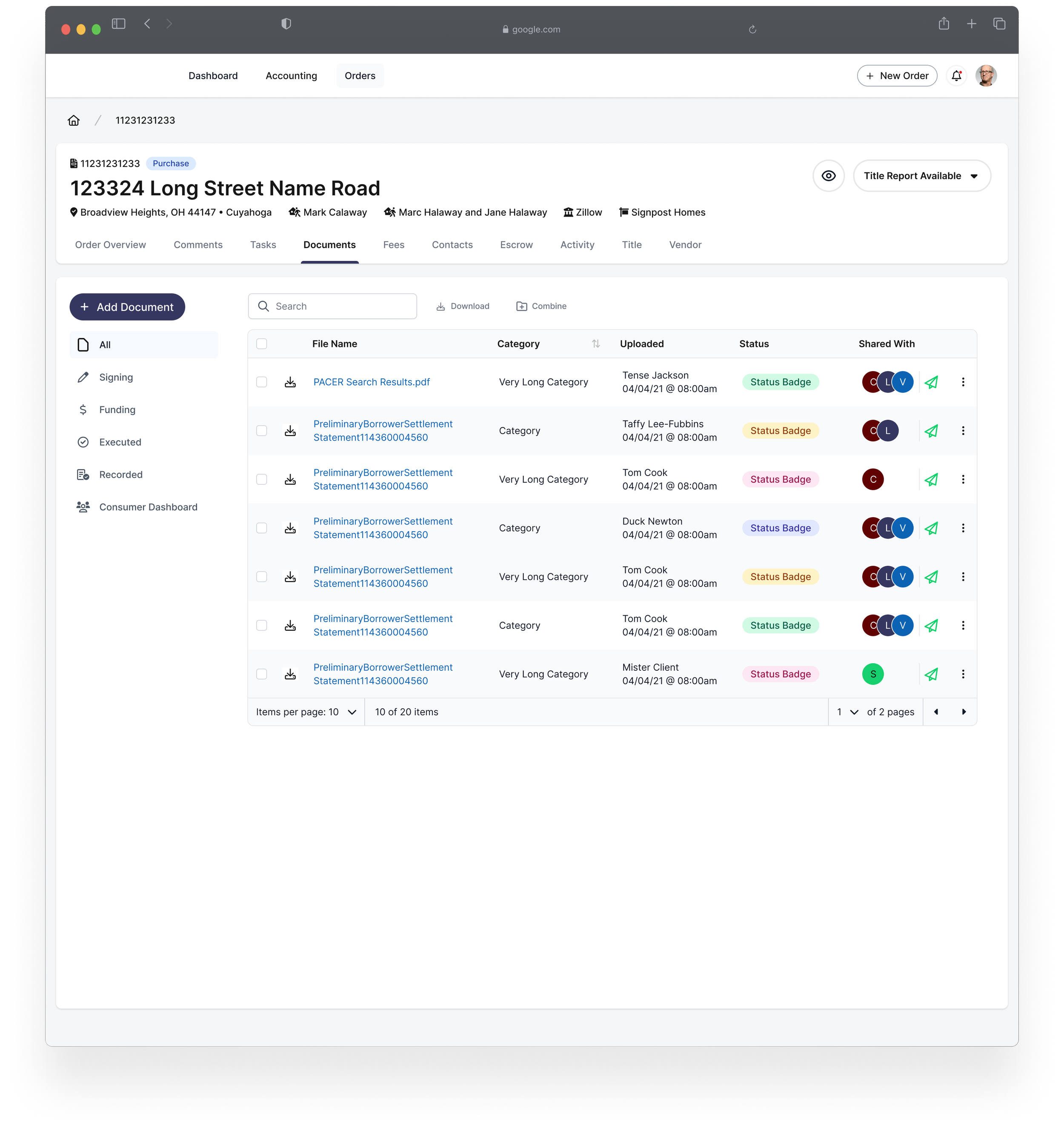
Multiple Document Uploads/Downloads: Now users can upload or download two or more documents at once, reducing time spent in files and allowing them to move on to other tasks.
Document Notes: Added the ability to attach notes to documents, helping reduce Slack messages that often get lost in channels.
Document Splitting and Merging: Users can now separate documents into individual files or combine multiple documents into a single package—greatly reducing reliance on Adobe Acrobat (which, if you’ve spent much time in, you’ll know is a game-changer).
Enhanced Document Deletion: Created a second action for deleting documents and replaced “destroy” with “delete” (as much as I miss the drama of “destroy,” it’s time for a cleaner approach).
Confirmation Modal for Deletion: Added an “are you sure?” prompt to prevent accidental deletions and minimize support tickets.
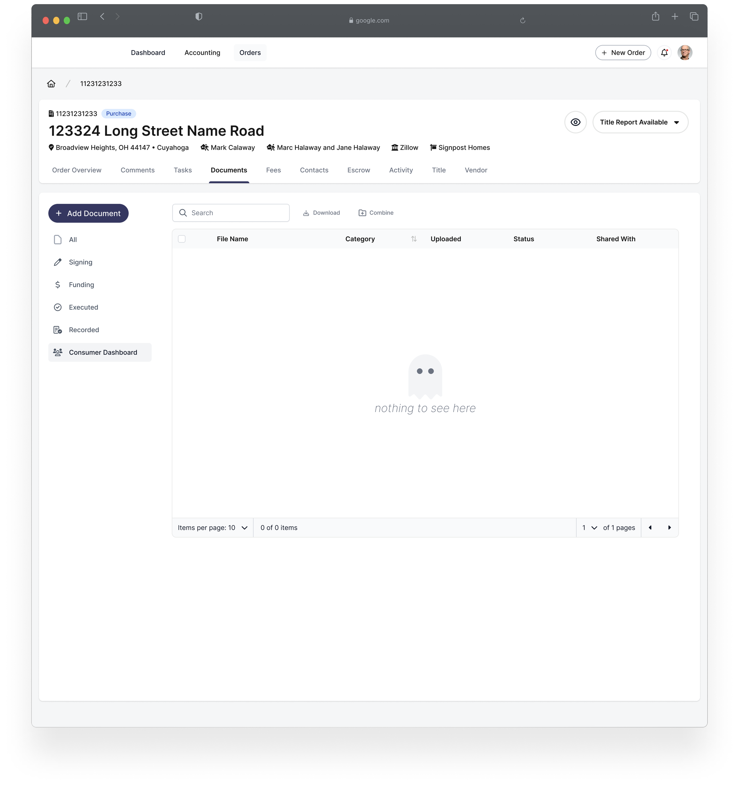
Document Categorization: Organized documents into different sections based on the stage of the transaction, eliminating the confusing “standard documents” card.
Updated Page Header: Not strictly a document feature, but since we’re overhauling the page’s style, the header should match the new design.
Publish to Share: Changed “publish” to “share” and allowed users to select where to share documents, plus generate a shareable link. Also added a new indicator to show where a document has been shared.
Automated Emails: Created a system where emails are automatically sent when a document is shared to a particular dashboard, cutting down on time spent manually sending notifications.
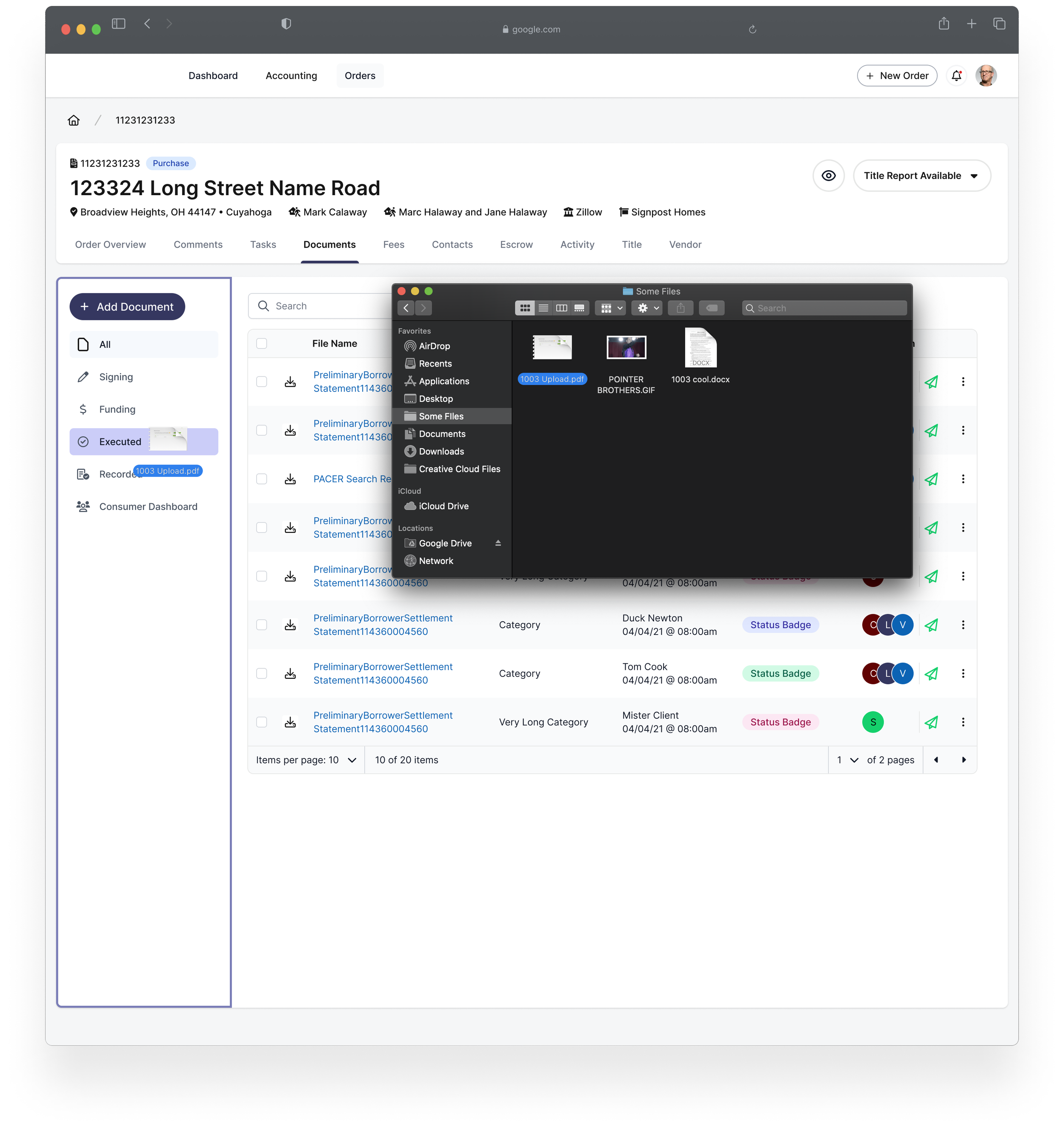
Drag-and-Drop Functionality: Users can now drag and drop files anywhere on the page to upload documents, and also move documents between sections by dragging them.
Simplified Document Creation: Introduced a single dropdown button to add or generate documents, freeing up space on the page and streamlining the process.
Streamlined Docs Table: Cleaned up the docs table with consolidated columns and added a search function—this was highly requested and, frankly, an obvious upgrade.
Here’s all the details:
The team
The team for this is pretty small (as usual):
product designer
product managers
ux researchers
frontend engineer
My role
Accidental Subject Matter Expert: Similar to the consumer dashboard, I spent a lot of time in the staging environment, getting familiar with its functions to the point where I had them memorized. My previous experience on the ReOps team made me particularly knowledgeable about this page and its features.
Wireframes: Developed both low and high fidelity wireframes for the project.
Prototyping: Created prototypes in both low and high fidelity to test and refine concepts.
Interaction Design: Focused on designing seamless user interactions throughout the experience.
Visual Design: Ensured the visual aspects were aligned with both user needs and brand guidelines.
Facilitated Feedback Sessions: Organized and led four feedback sessions, with a total of 15 participants. Each session lasted between 40 and 60 minutes.
Collaboration Across Departments
Worked closely with the frontend developer to ensure that my designs were feasible and aligned with technical constraints.
Partnered with PMs for frequent feedback sessions and attended team standups and sprints to stay aligned with ongoing work.
Frequent Sharing of Updates
Regularly shared design updates and information with the team (without overdoing it in Slack), actively seeking feedback and addressing any questions that arose.
We had some challenges
The problems
We regularly receive feedback from members of the Real Estate Ops team, Sales, and Client Success Associates regarding the documents page.
The key takeaways from that feedback included:
Reorganize Document Tables: Separate different document types into distinct tables or sections, rather than having a single, overcrowded "standard documents" section.
Section Selection for Uploads: Allow users to select specific sections when uploading documents, making the process more intuitive.
Drag-and-Drop Functionality: Enable users to drag and drop documents between tables once they’ve been uploaded.
Eliminate "Destroy": Replace the "destroy" label with something clearer and less alarming.
Revise "Publish" Language: Update the "publish" language to be more intuitive and action-oriented.
As a result, we were tasked with creating a more streamlined and organized experience for internal users, focusing on simplifying the categorization, management, and sharing of documents essential to completing real estate transactions successfully.
The requirements
Upload/Download Multiple Documents Simultaneously: Streamline the process by allowing users to upload and download multiple documents at once.
Combine Multiple Documents: Enable users to merge several documents into a single file for easier management.
Split Documents: Allow users to separate a single document into multiple files as needed.
New Document Categories: Introduce clear categories for documents, including All, Signing, Executed, Funding, Recording, and Homeowner Portal, for better organization.
Improved Document Deletion: Enhance the document deletion process to prevent errors and improve usability.
Improved Document Sharing: Simplify and streamline how documents are shared with clients, lenders, and other stakeholders.
SignatureSync Integration: Plan for future integration with SignatureSync to enable seamless e-signatures within the platform.
These were the initial requirements, which evolved as I gained a deeper understanding of the unique processes within each team and learned more about the day-to-day challenges faced by the Real Estate Ops team.
And we had some solutions
The feedback sessions
We held four feedback sessions with a total of 15 participants, each lasting between 40-60 minutes. During these sessions, we presented the initial designs (with prototypes coming later after the first round of feedback). Here’s what we learned:
Icons on the Right Confused Users: Although tooltips were provided to explain each icon, the placement wasn’t intuitive enough. Users also accidentally pressed the icons while scrolling on the right side of the page, leading to issues like hitting the "destroy" button by mistake.
Download Option Placement: Users preferred the download option to be moved to the left side of the page, a change that was originally made in a previous update. This preference seemed to be a matter of muscle memory, as users were accustomed to having download options on the left.
Frustration with Previous Updates: A significant portion of one session focused on participants expressing frustration over the previous change. We had to gently steer the conversation, reminding participants that this wasn’t the most productive area of discussion.
Ability to Add Notes to Documents: While this wasn’t initially part of our plan, participants requested the ability to add notes to specific documents. This was a new insight we hadn’t considered.
Timestamping Changes: There was strong feedback that all changes should be timestamped, showing when something was modified and who made the change. This would be particularly useful for tracking document revisions and auditing purposes.
Positive Feedback on New Sections: Participants appreciated the new sections, as they helped streamline the discovery process and improved overall document management.
Appreciation for the New Layout: The new layout received positive feedback, with many describing it as “much cleaner” than the previous version. While the layout was well-received, there were still opportunities for improvement.
The updates
After the user sessions, I made adjustments based on feedback from our participants, design team peers, and UX researchers:
Order Status in the Order Header: I added the order status to the header to provide immediate context to users.
Clear Download Icon Next to File Name: To make document actions more intuitive, I added a clear, easy-to-find download icon next to the file name.
Status Pills for Future Tagging Work: Since some documents arrive incomplete, I introduced status pills that show which documents need updates, allowing us to track the progress more effectively.
Kebab Menu with Additional Functions:
Added options to delete documents.
Enabled generating a shareable link.
Added functionality to share documents with specific parties via the API.
Included the ability to see document details, which opens a side menu displaying key info: document update history (who updated it and when), due dates, sharing details, and any added notes.
Drag and Drop Indicators: Previously, users couldn’t tell if a document was being successfully dragged and dropped. Now, the page highlights in our brand color (spurple) and shows a toast notification to confirm the action.
Improved Notifications: While this is slightly separate from the docs page, I’ve also designed toast notifications for use throughout this page and the rest of Pinecone.
Modals for Combining and Separating Documents: I streamlined the process by adding modals to allow users to combine or separate documents, eliminating the need for external tools like Adobe Acrobat for document editing.
This brings us to where we are now: a highly detailed prototype, a cleaner UI, an improved UX, and a more organized Figma file. Our UX researchers are now working on more in-depth research and have a plan for user testing at a later date.
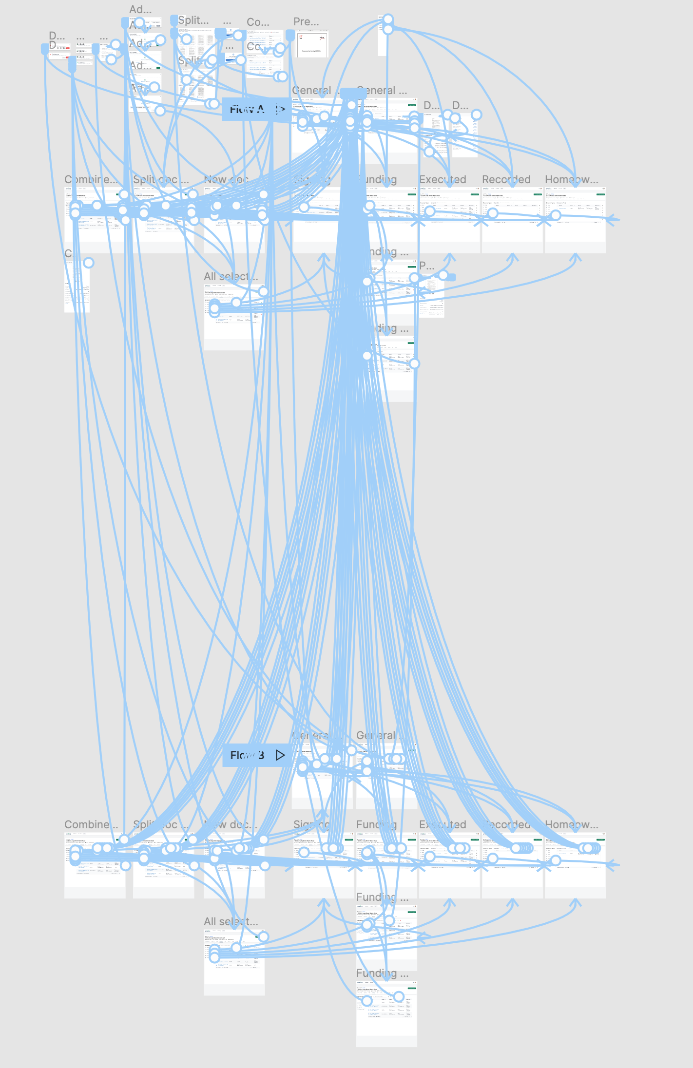
[note from the future; this project was made a couple of years before figma cleaned up their prototyping feature, so you won’t be seeing much of those blue lines anymore.]
this is where user testing would go
if we had any.
The docs tab update was deprioritized due to engineering resources being directed toward the transition from Rails to Timber, a significant undertaking. No hard feelings there.
I’m excited to do more for this page in the future—I can already spot areas where further improvements can be made. A fresh perspective will definitely help us continue refining the experience.
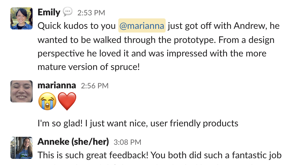
That said, the recent prototype I created caught the attention of our COO, Andrew, and he was a big fan. So that’s a win! [Sadly, I don’t have a video to share here.]

